So...I've complained. I've complained A LOT, about the way KH3 looks since the E3 2015 trailer. Honestly, I could almost say I was let down by Square after seeing the way game looked on the Unreal engine 4 compared to the way it used to look on the Luminous Engine, BUT I'm more than happy to say that my complaints were absolutely pointless. Yep, the 0.2 footage from E3 convinced me that KH3 is going to look just as good as we all want it to look. How? Well let's see!
EXHIBIT A: The environments
They were never a problem, but it was great to see that the environments are still looking great. The textures, the details, the lighting, EVERYTHING is just perfect. But they looked just as good in the KH3 trailers so...Nothing to complain about here.
EXHIBIT B: The particle effects...and other effects x)
The magic, the effect it has on the environment it...it all looks so beautiful. Visually, it couldn't get any better. Once again, that's nothing new, it always looked great
EXHIBIT C: The character models
That was my main issue with KH3's look. The character models. In the very first trailer we were promised the characters would look a certain way and the latest trailers didn't live up to my expectations. They said Sora would look like this: Instead, he looked like that: And then we had terrible character models for Mickey, Riku, Kairi and Yen Sid. They all looked like Barbie dolls. The latest footage for 2.8 has shown immense improvement in the character models. As you can see in this screenshot featuring Ephemera, the character's hair and clothing are a lot more detailed and textured which is great. Their skin also doesn't look as "plasticky" as the previous screenshot which removes the doll effect Strangely, in the 0.2 portion of the trailer, Aqua's model still suffers of the doll effect. Her hair and cloth are really detailed but her skin still looks like plastic. I think that's mainly because of the lighting. It looks like Square has been having a hard time with finding the right lighting for night time with the new engine and that gives the characters like Terra, Aqua, Riku and Kairi a weird look since they were all in "nightime lighting" (Mysterious Tower & Realm Of Darkness are "night themed"). But as we've seen with X Back Cover, the right lighting seems to fix every problem.
EXHIBIT D: The Art Direction (See attached files)
As I mentioned earlier, with the very first trailer of KH3, Square showcased some graphics and they haven't really delivered what they promised. That's not because the Unreal Engine isn't good enough but because they changed the art direction. It wasn't clear what art direction they were going for with the 2015 trailers for KH3 but, for me, the 0.2 footage we've seen made the art direction clearer and it's actually something they teased in the very first trailer. If you look at the 0.2 cutscenes from the E3 demo, you'll notice that Aqua actually looks a lot like her model from the pre-rendered cutscenes. It doesn't really show in the E3 2016 trailer but it does in the demo.
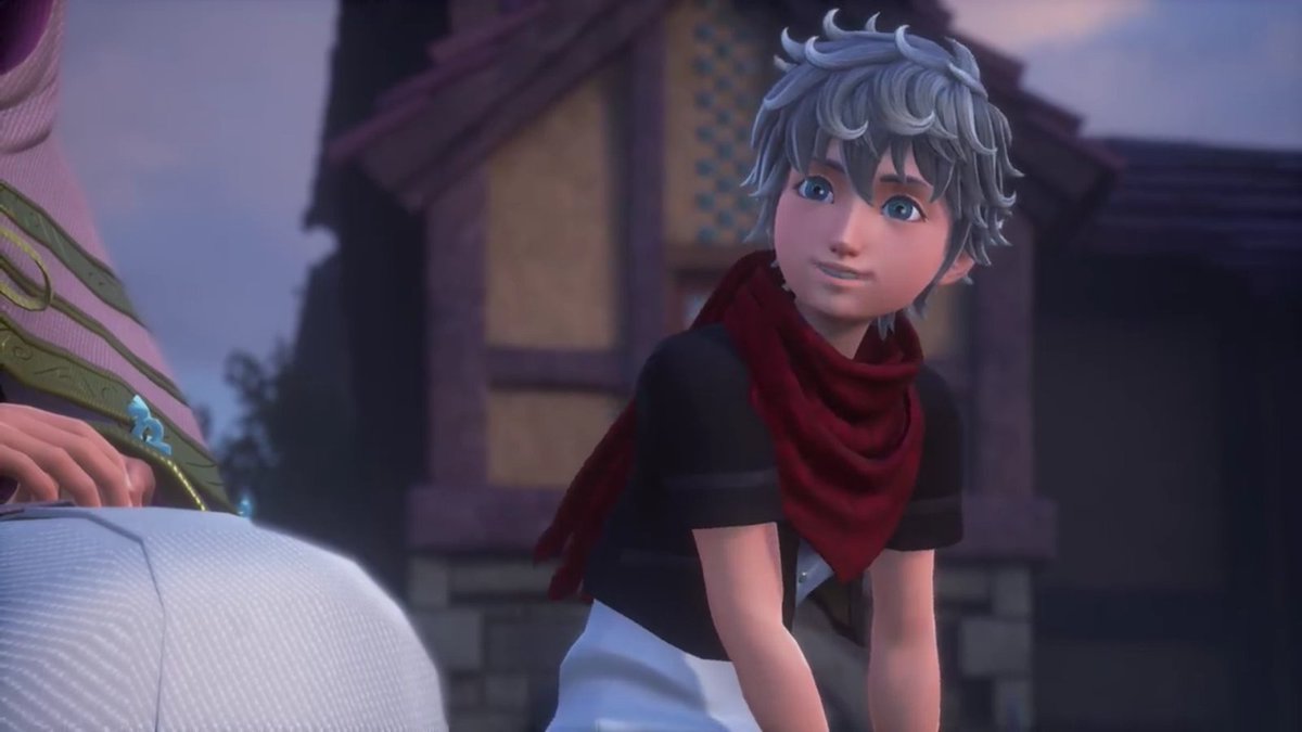
Even Terra, whose model probably isn't finished since it doesn't look very detailed, looks a bit like his pre-rendered counterpart.
The main difference with their pre-rendered counterparts is that they look a bit more cartoony in the game. And I think that's exactly what Square is going for. Instead of making the characters look exactly like they do in the pre-rendered cutscenes, they are trying to make them look like their pre-rendered counterparts but with a cartoonish touch to capture the Disney aspect of KH. And they've shown that in the very first trailer, when "KH3D Sora" transitioned into "KH3 Sora".
This might not be a revelation to everyone, but it enlightened things for me and I know other people like me complained about the visuals for KH3 so I wanted to show everybody that there is nothing to complain about. Square just has to get the "night lighting" right and everything'll be good I'm satisfied with KH3's look. Share your thoughts


So...I've complained. I've complained A LOT, about the way KH3 looks since the E3 2015 trailer. Honestly, I could almost say I was let down by Square after seeing the way game looked on the Unreal engine 4 compared to the way it used to look on the Luminous Engine, BUT I'm more than happy to say that my complaints were absolutely pointless. Yep, the 0.2 footage from E3 convinced me that KH3 is going to look just as good as we all want it to look. How? Well let's see!
EXHIBIT A: The environments
They were never a problem, but it was great to see that the environments are still looking great. The textures, the details, the lighting, EVERYTHING is just perfect. But they looked just as good in the KH3 trailers so...Nothing to complain about here.
EXHIBIT B: The particle effects...and other effects x)
The magic, the effect it has on the environment it...it all looks so beautiful. Visually, it couldn't get any better. Once again, that's nothing new, it always looked great
EXHIBIT C: The character models
That was my main issue with KH3's look. The character models. In the very first trailer we were promised the characters would look a certain way and the latest trailers didn't live up to my expectations. They said Sora would look like this: Instead, he looked like that:
  And then we had terrible character models for Mickey, Riku, Kairi and Yen Sid. They all looked like Barbie dolls.
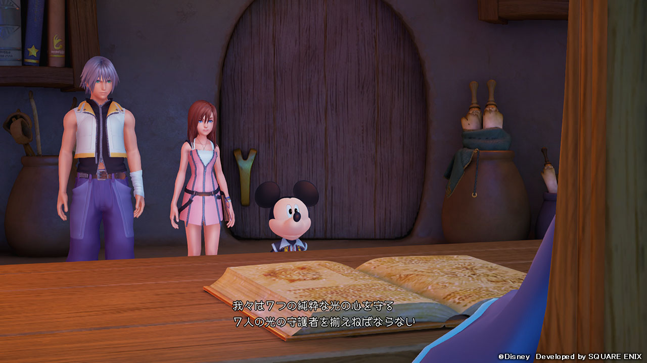 The latest footage for 2.8 has shown immense improvement in the character models. As you can see in this screenshot featuring Ephemera, the character's hair and clothing are a lot more detailed and textured which is great. Their skin also doesn't look as "plasticky" as the previous screenshot which removes the doll effect
 Strangely, in the 0.2 portion of the trailer, Aqua's model still suffers of the doll effect. Her hair and cloth are really detailed but her skin still looks like plastic. I think that's mainly because of the lighting. It looks like Square has been having a hard time with finding the right lighting for night time with the new engine and that gives the characters like Terra, Aqua, Riku and Kairi a weird look since they were all in "nightime lighting" (Mysterious Tower & Realm Of Darkness are "night themed"). But as we've seen with X Back Cover, the right lighting seems to fix every problem.
EXHIBIT D: The Art Direction (See attached files)
As I mentioned earlier, with the very first trailer of KH3, Square showcased some graphics and they haven't really delivered what they promised. That's not because the Unreal Engine isn't good enough but because they changed the art direction. It wasn't clear what art direction they were going for with the 2015 trailers for KH3 but, for me, the 0.2 footage we've seen made the art direction clearer and it's actually something they teased in the very first trailer. If you look at the 0.2 cutscenes from the E3 demo, you'll notice that Aqua actually looks a lot like her model from the pre-rendered cutscenes. It doesn't really show in the E3 2016 trailer but it does in the demo.
Even Terra, whose model probably isn't finished since it doesn't look very detailed, looks a bit like his pre-rendered counterpart.
The main difference with their pre-rendered counterparts is that they look a bit more cartoony in the game. And I think that's exactly what Square is going for. Instead of making the characters look exactly like they do in the pre-rendered cutscenes, they are trying to make them look like their pre-rendered counterparts but with a cartoonish touch to capture the Disney aspect of KH. And they've shown that in the very first trailer, when "KH3D Sora" transitioned into "KH3 Sora".
This might not be a revelation to everyone, but it enlightened things for me and I know other people like me complained about the visuals for KH3 so I wanted to show everybody that there is nothing to complain about. Square just has to get the "night lighting" right and everything'll be good I'm satisfied with KH3's look. Share your thoughts
Edited by PrinceNoctis