Posted December 8, 201212 yr I think the new layout looks HORRIBLE!!! I have to go onto a different link to see my Subscribed videos. And I have to click another link to see only the videos that they upload! Before: After: See the difference!! I HATE IT!!!
December 8, 201212 yr I don't like the change especially to the main page but it doesn't bother me that much. <_<
December 8, 201212 yr Well, I don't go that much on Youtube. It's always bad to change, but I don't know if it's better MEGA WORSE or not...
December 8, 201212 yr I don't see a difference. For me it looks like the old Youtube, only the buttons are different. Edited December 8, 201212 yr by Snow
December 8, 201212 yr It just seems to messy and unorganized for my taste. The older one was much simpler and easy to navigate (in my opinion). Edited December 8, 201212 yr by xoblivionx13
December 8, 201212 yr I gotta say it's really good. At first I hated it but with getting used to I gotta say it's the best layout in a couple years.
December 8, 201212 yr There are parts I like, and parts I dislike, though the bad seems to outweigh the good. Things I like: I do like a few things about it. The overall look of Youtube isn't really bad. If they had have thought things through a little better, I think it could have looked even better. Another thing I do like is the easy access to a list of all your subscriptions, though that's really it. The look of the Youtube video viewer thing-a-majig is also nice, and I certainly like what they did with the playlists, it's nice to have it right next to the video as opposed to at the bottom where it gets in the way. Things I dislike: First and foremost: The way the main page works. I want to see what my Subscriptions are doing, that's it. I don't really care about what Youtube 'thinks' I should watch. That's what the obscure little "Recommended videos" was for in the previous version, keep it away from my main video bar please! Speaking of which, what the hell is up with the huge blank spot on the right? Seriously, it's stupid. Another thing, I want to have a permanent selection of whether or not I want to view uploads only from my subscriptions. It's annoying to have to change it back every time I switch to something else. Youtube, oh why did you feel the need to add people's pictures to the comment section? I could care less about what people choose for that. I don't want to be looking through the comments and see a picture of some little kid. Why did you also feel the need to move the like bar to that awkward position? I forget about it when it's down there D: And finally, why did you remove the notifications of comments and inboxes from the main page? This displeases me greatly D:< Edited December 8, 201212 yr by Keyblader
December 8, 201212 yr I don't like it all too much. The past oen had exactly what I wanted, and nothing more. This new one offers too much, all of it a tad annoying. But I can deal with it for now.
December 8, 201212 yr It's okay, but I don't see myself actually liking it any time soon. It's too... ugly.
December 8, 201212 yr So far I'm mainly annoyed by the fact there isn't a drop down button to look at the person's other videos unless you're in a playlist >___> I don't really like how it looks overall but I can get used to that, it just the annoying navigation is just... blah
December 8, 201212 yr Why'd they have to change it? It was fine before they edited it. Now, if the layout gets edited ever again, I will sue YouTube.
December 8, 201212 yr I think the new layout looks HORRIBLE!!! I have to go onto a different link to see my Subscribed videos. And I have to click another link to see only the videos that they upload! Before: last time.png After: after.png See the difference!! I HATE IT!!! It sucks now!! (AND PERSONA 4, POKEMON, AN DUEL MONSTERS GX FTW)
December 8, 201212 yr Main page is decent, but when you watch videos the whole layout is absolutely terrible
December 8, 201212 yr There are parts I like, and parts I dislike, though the bad seems to outweigh the good. Things I like: I do like a few things about it. The overall look of Youtube isn't really bad. If they had have thought things through a little better, I think it could have looked even better. Another thing I do like is the easy access to a list of all your subscriptions, though that's really it. The look of the Youtube video viewer thing-a-majig is also nice, and I certainly like what they did with the playlists, it's nice to have it right next to the video as opposed to at the bottom where it gets in the way. Things I dislike: First and foremost: The way the main page works. I want to see what my Subscriptions are doing, that's it. I don't really care about what Youtube 'thinks' I should watch. That's what the obscure little "Recommended videos" was for in the previous version, keep it away from my main video bar please! Speaking of which, what the hell is up with the huge blank spot on the right? Seriously, it's stupid. Another thing, I want to have a permanent selection of whether or not I want to view uploads only from my subscriptions. It's annoying to have to change it back every time I switch to something else. Youtube, oh why did you feel the need to add people's pictures to the comment section? I could care less about what people choose for that. I don't want to be looking through the comments and see a picture of some little kid. Why did you also feel the need to move the like bar to that awkward position? I forget about it when it's down there D: And finally, why did you remove the notifications of comments and inboxes from the main page? This displeases me greatly D:< The part in bold . That's like my only complaint Other than that, it's a lot like the "old" Youtube and we all got used to the "old" Youtube, and we'll get used to this too Now all I want is the Early 2010 YouTube
December 8, 201212 yr All I would wish is that Google would focus on fixing the bugs on youtube before introducing new formattings.Also, my only complaint is that when you watch a video on its actual page, you can't browse through the last few videos the uploader has posted without actually going onto their page. Oh, and the really ugly white space to the right. I'm blinded by all of this light reflecting back at me, and it's way too left aligned. >>
December 8, 201212 yr It's a lot of "white space" if you know what I mean. Sometimes that's good. Sometimes that's bad. For this one, I haven't yet decided. I can at least say I don't "hate" it, but that doesn't necessarily mean I like it. I'll forget about in like 2 weeks
December 8, 201212 yr Ever since Google owned YouTube it's been horrible. Down with Google! A new era has arrived, the era where YouTube is owned by KH13!
December 8, 201212 yr They actually added functionality to this update instead of just reorganizing everything. Considering they haven't done that since like 2007 I'd say this is a good update.


I think the new layout looks HORRIBLE!!! I have to go onto a different link to see my Subscribed videos. And I have to click another link to see only the videos that they upload! Before: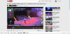 After:
 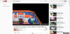 See the difference!! I HATE IT!!!