Jump to content
View in the app

A better way to browse. Learn more.

KH13 · for Kingdom Hearts

A full-screen app on your home screen with push notifications, badges and more.

To install this app on iOS and iPadOS
  1. Tap the Share icon in Safari
  2. Scroll the menu and tap Add to Home Screen.
  3. Tap Add in the top-right corner.
To install this app on Android
  1. Tap the 3-dot menu (⋮) in the top-right corner of the browser.
  2. Tap Add to Home screen or Install app.
  3. Confirm by tapping Install.

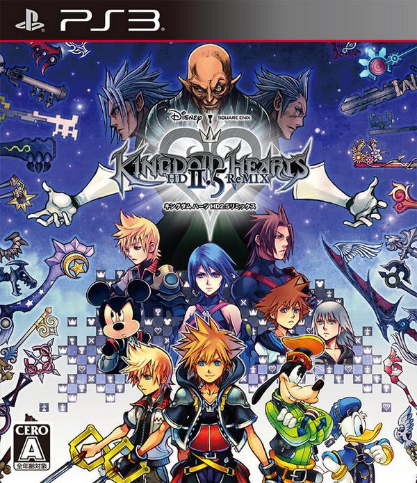
Kingdom Hearts HD 2.5 ReMIX cover revealed

Square Enix has updated the official Japanese website for Kingdom Hearts HD 2.5 ReMIX with the cover artwork for Kingdom Hearts HD 2.5 ReMIX. Below you can view the cover, as well as the artwork by itself.

User Feedback

Recommended Comments

esu1549

Member

BEST COVER EVER!!!!!!!!!!!! Look at MX's face haha...

TheKingdomkid

Member

Nice box art was expecting something similar to 1.5 but this is ok as well

KH4Real

Member

When I saw the news collectors pack revealed I though would the cover been out? Yes there it is :).

I prefered more the 1.5 with more colors. At least they want to be original. Good job!

Demyx.

Member

It looks cool...But then master xehanorts face firetrucks it up soooo bad. xD

Caity

Member

I was expecting something similar to 1.5.  While it looks kinda neat, MX's very detailed old face makes everyone look baby faced.  I think the KH pixelization pattern they did would have been nicer fading from the bottom up of the case up instead of at the end of the characters 'cause with all the people and keyblades it does look very cluttered and messy.  Plus there is room for Kairi either beside Roxas or between Aqua and Mickey, even BBS age Kairi just.  The picture looks better with the PS3 strip and cropped at the bottom than without.  I thought 1.5 was beautiful when it was revealed, this doesn't blow me away at all.  The concept was good but the execution failed in my opinion.


- I don't think that Ansem SOD was suppose to be in the cover because his role was not that much in these three games, but I do understand what they meant to do by putting him behind MX with Xemnas.


I didn't think that was Xemnas behind him, I thought it looked more like Terranort to me, Xemnas hair in art form is pretty much like Ansem SOD's with more divided spikes at the top and side strips of hair fanning backwards on the side, with a curtain fringe. Which just makes it seem like they threw Ansem SOD in to make it symmetrical to me.

Hazimie

Member
(edited)

To be honest,Xehanort's face ruin this beautiful artwork... :P

Edited by Hazimie

Keyblader_95

Member

What's wrong with all these people complaining about the cover? My god, it's AMAZING. Nothing looks confusing at all, I prefer this to 1.5's cover. This one is a perfect mash-up of the chapters in question, without being organized in sections. I've noticed too that the drawings looks different than the usual, more cartoony and youngish, but that doesn't mean they are bad; quite the contrary in my opinion: I think the drawing technique is rather original and fresh, indeed different, but just as beautiful as all the others. Plus, the way this ArtWork was conceived is clearly an anticipation of Kingdom Hearts III, in my opinion: the way Xehanort and his other selves are disposed, behind the Heroes, bigger sized, hints of course that Xemnas and Ansem SOD are part of the same person as we already knew, but also that they are conspiring against the Heroes, lurking in the darkness, ready to meet the Lights in the final clash. Also, am I the only one who perceive a sense of anticipation in the characters presence? I know they are there to represent the chapters in the 2.5 bundle, but this ArtWork just gives me a strong sense of Kingdom Hearts III, a feeling of an impending return; and as I said already, I'm quite sure this cover was meant to transmit this feeling xD

SHAZOW

Member

It looks really good. I have my fingers crossed for the HD collections to be ported onto the PS4 <3 (because sheep happens so I don't have a PS3 anymore, it's complicated but I doubt I'll get it back :/)

Hero of Winds

Member

Nice to see them escape our expectations with an original cover rather than a mash up of previous covers as they did with 1.5.

No Kairi and no Vanitas, that's sad (truly). BUT THE COVER ART LOOKS SO AMAZING I CAN'T EVEN DESCRIBE MY FEELINGS, I LOVE IT <3

Aang

Member

What I don't like about it is Xehanort looks like Yoda and Gollum had a baby. Creepy? I agree! Anyhow, I think there faces are too young, and they don't at all look like they are aware of each others presence. I liked seeing them interact like in other ones, I think they crammed too much in, regardless, I'm pre-ordering! 

Cheers,


-Aang

KHLegendIII

Member

I like this cover. Although, this cover or something like it should have been used for KH3, but it doesn't matter, I really like it.

What a great cover! but wow, dat Xehanort's face tho...

Nweintraub

Member

The nort brothers on the cover look so creepy! But the one in the middle, Master Xehanort, tops the list, he looks like a creepier version of King Bumi from Avatar: the Last Airbender: Book 2: Earth. That's alot of :'s, don'cha think?

J. Severe

Member

AHHHHH this looks incredible


Only problem I have with it is Xehanort's derp face but other than that this is some god-tier art.

Join the conversation

You can post now and register later. If you have an account, sign in now to post with your account.

Guest
Add a comment...

Configure browser push notifications

Chrome (Android)
  1. Tap the lock icon next to the address bar.
  2. Tap Permissions → Notifications.
  3. Adjust your preference.
Chrome (Desktop)
  1. Click the padlock icon in the address bar.
  2. Select Site settings.
  3. Find Notifications and adjust your preference.
Scroll to the top