Jump to content
View in the app

A better way to browse. Learn more.

KH13 · for Kingdom Hearts

A full-screen app on your home screen with push notifications, badges and more.

To install this app on iOS and iPadOS
  1. Tap the Share icon in Safari
  2. Scroll the menu and tap Add to Home Screen.
  3. Tap Add in the top-right corner.
To install this app on Android
  1. Tap the 3-dot menu (⋮) in the top-right corner of the browser.
  2. Tap Add to Home screen or Install app.
  3. Confirm by tapping Install.

Kingdom Hearts HD 2.5 ReMIX cover revealed

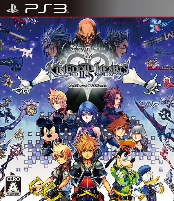
Square Enix has updated the official Japanese website for Kingdom Hearts HD 2.5 ReMIX with the cover artwork for Kingdom Hearts HD 2.5 ReMIX. Below you can view the cover, as well as the artwork by itself.

User Feedback

Recommended Comments

Geotrix

Member

This cover art looks really nice! Much prefer it compared to the 1.5 one!

Dio Brando

Member

The cover looks AWESOME ^_^


Even though Master Xehanort's face looks a bit more creepier 

AZV_4th

Member
(edited)

The cover looks incredible! But I do have one tiny complaint...


Why is Kairi not on the cover?!


Peace!

I finally made an account, just to ask that question. I mean there's plenty of room next to Roxas, isn't there? 

Edited by AZV_4th

Sora96

Member

Updated with higher resolution version.

Ultima Spark

Member
(edited)

Eh, I prefer 1.5's cover. What's with Xehanort's face?


He's a creepy old git anyway lol


More seriously, am I the only one who thinks everyone looks a bit too, I don't know, baby-faced?


(also can someone please translate the JP text on the second image?)

Edited by Ultima Spark

AaySquare

Member

LOL So many characters packed on the box art, still missing Kairi however. Looks amazing though.

DawnBreaker

Member

Zero-One from coded

Ah thanks, Re:Coded is the only one i havent played  :wink:

My only complaint is Xehanort looks alot more creepy that usual and where tf is Kairi & Namine at? Other than that 1000/10.

AwesomeKHfan

Member

I expected something else but this is good enough for me

To be honest, seeing this one, makes me prefer 1.5, it's much cleaner (and I didn't like it much), I just think they could have done better, much better.I think Xehanort and his other selfs behind him side by side are perfectly fit.while the rest feels confusing and too mishmach, overloading, the part that bothers me the most it's the keyblades and how the characters over Sora are set.they could have done better, kinda disappointed? yes, oh well I will buy for the games inside anyway.

HaneulWay

Member

I'm literally crying right now. Not like that fake expression I'm literally crying. There are tears on my keyboard. I feel like a proud daddy right now. What a weird thing to say ;u;.

XantheGamesHD

Member

Can some please translate what it says on the top of the second picture, I'm very curious

Sora96

Member

Can some please translate what it says on the top of the second picture, I'm very curious


It's most likely just crediting the artist or something. Wouldn't be major.

Aile

Member

It looks awesome! Xehanorts face creeps me out tho xD

Kodakliv

Member

Very cool artbox! I love all the Ksyblades it makes me remember what each story is a about.

Join the conversation

You can post now and register later. If you have an account, sign in now to post with your account.

Guest
Add a comment...

Configure browser push notifications

Chrome (Android)
  1. Tap the lock icon next to the address bar.
  2. Tap Permissions → Notifications.
  3. Adjust your preference.
Chrome (Desktop)
  1. Click the padlock icon in the address bar.
  2. Select Site settings.
  3. Find Notifications and adjust your preference.
Scroll to the top